The WeCamp app is a convenient way to order camping gear from your mobile device. It features a wide range of camping supplies, advices for campers, real-time order tracking, and a range of delivery methods.
The problem
People nowadays tend to use online platforms to buy things instead of going to the store directly. This is because it saves time and avoids the stress of physical stores.
The solution
The goal was to design a mobile app that lets users quickly and easily order camping supplies from WeCamp – a hypothetical store.
Processus UX
User Pain Points
Navigating through a large store layout can be overwhelming, and users may struggle to locate specific items they need for their camping trip.
Users might encounter staff members who lack sufficient knowledge about camping equipment, making it challenging for them to get accurate advice or recommendations.
Users may face difficulties transporting bulky camping equipment purchased from the store, especially if they don’t have access to a vehicle or live far away.
Shopping website designs are often busy, which results in confusing navigation
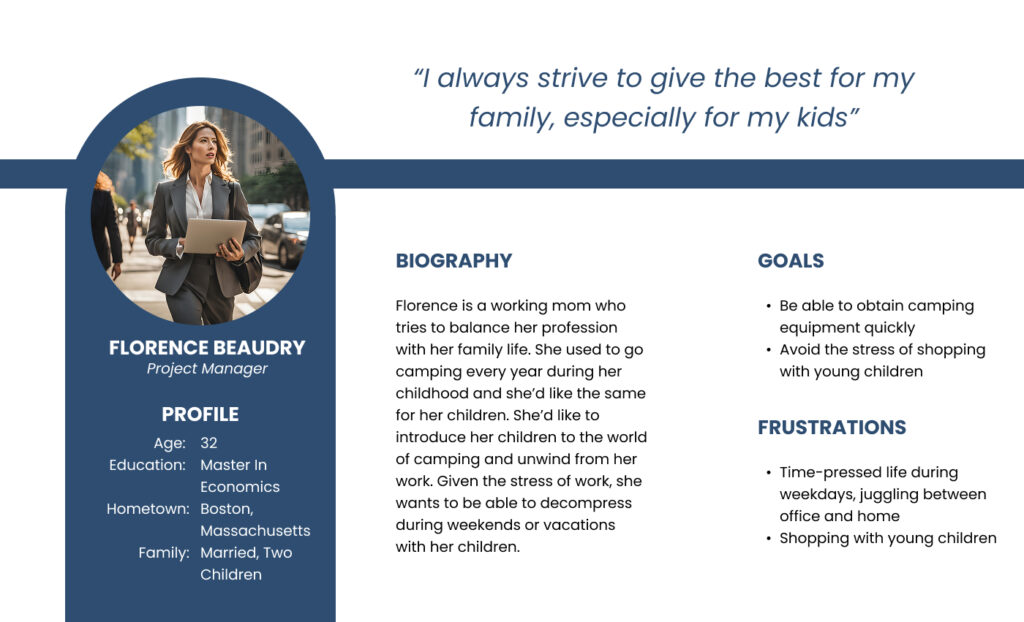
Personas
UI Design Solution
Visual Design
High-Fidelity Mockups – Key Features
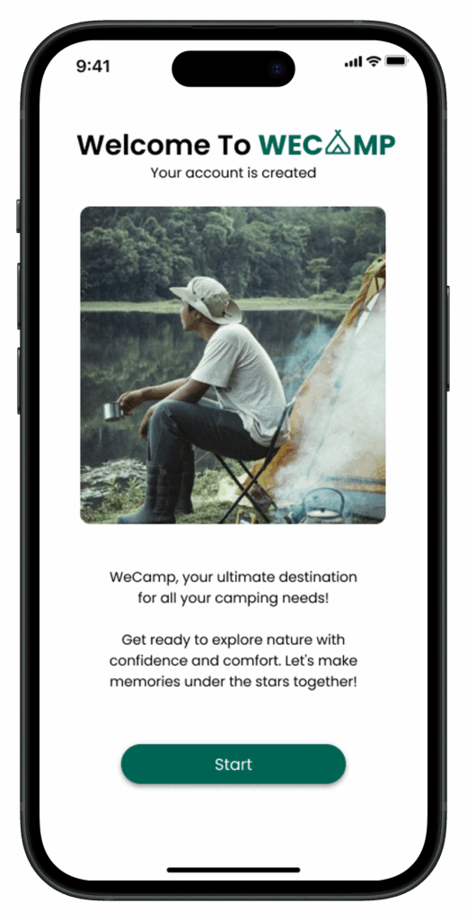
Feature 1: Onboarding screen
A friendly onboarding flow welcomes users and introduces the app’s main features, ensuring an easy first experience.
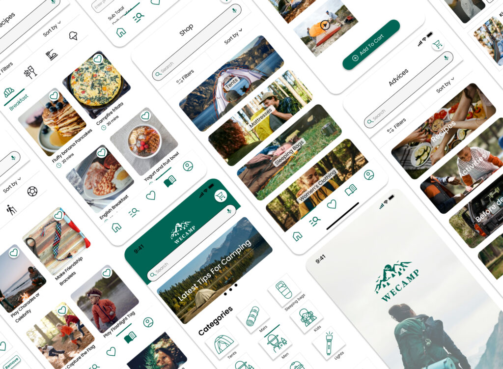
Feature 2: Personnalized Homepage
A clean, organized homepage featuring product categories, best-sellers, and tailored recommendations for faster discovery.
Feature 3: Intuitive Navigation
A clear bottom navigation bar gives quick access to Home, Shop, Favorites, Advice, and Profile — making exploration effortless.
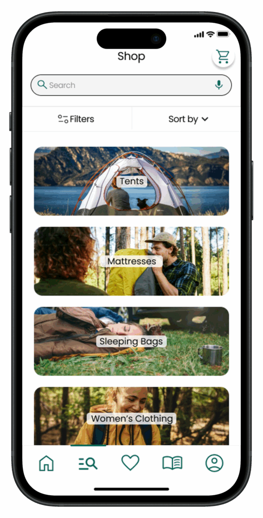
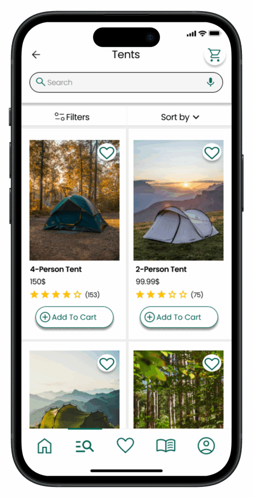
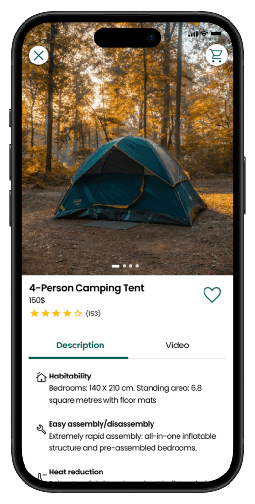
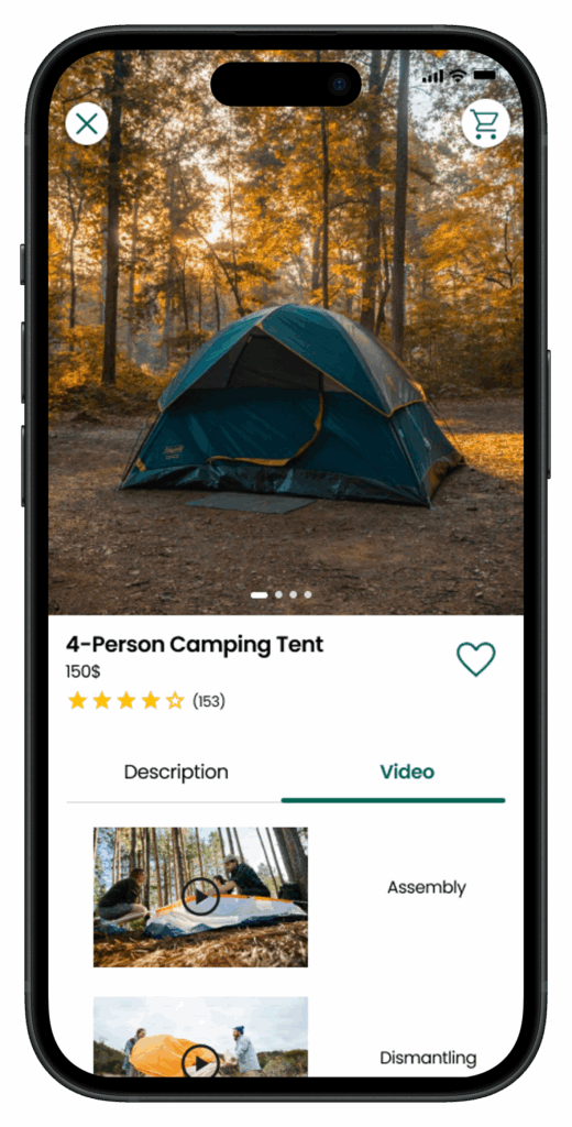
Feature 4: Smart Product Search & Filtering
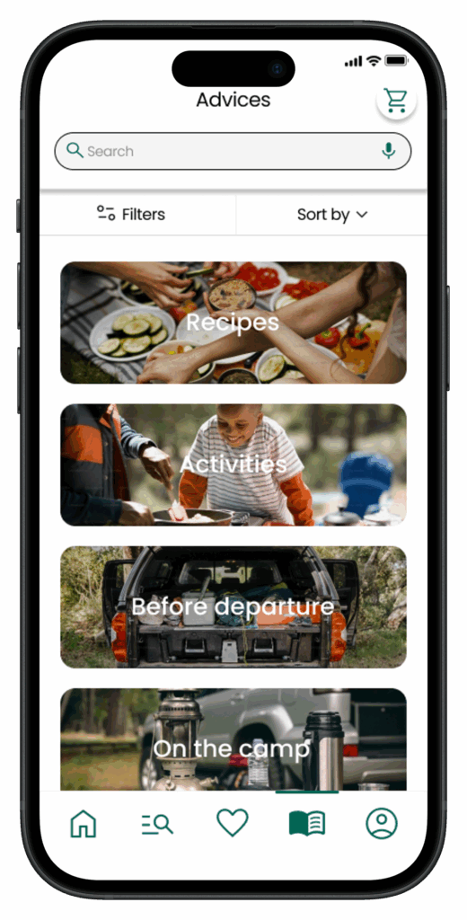
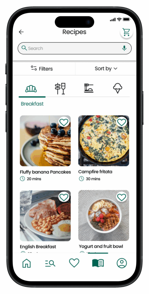
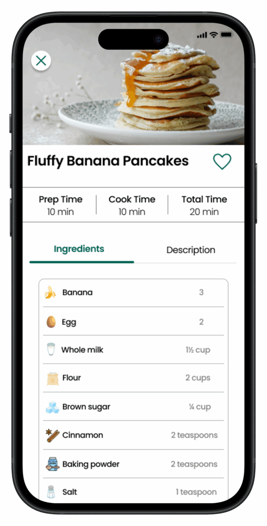
Feature 5: Advice and Inspiration
A dedicated space with camping recipes, activity ideas, and practical tips replaces the need for in-store assistance.
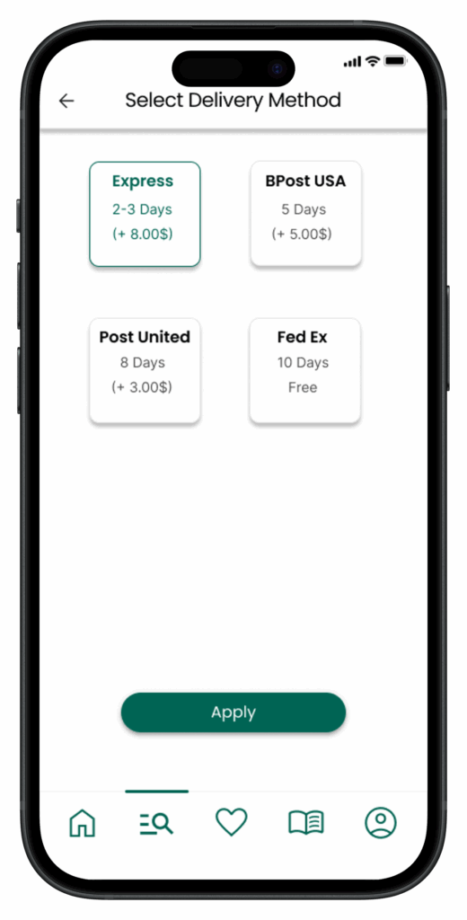
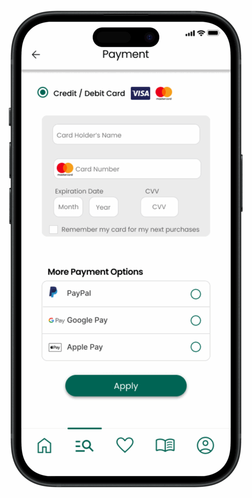
Feature 6: Multiple Delivery and Payment Options/Real-Time Order tracking
The user can select their delivery preference
The user can select their payment preference.
The user can track their order in real-time.
Accessibility considerations
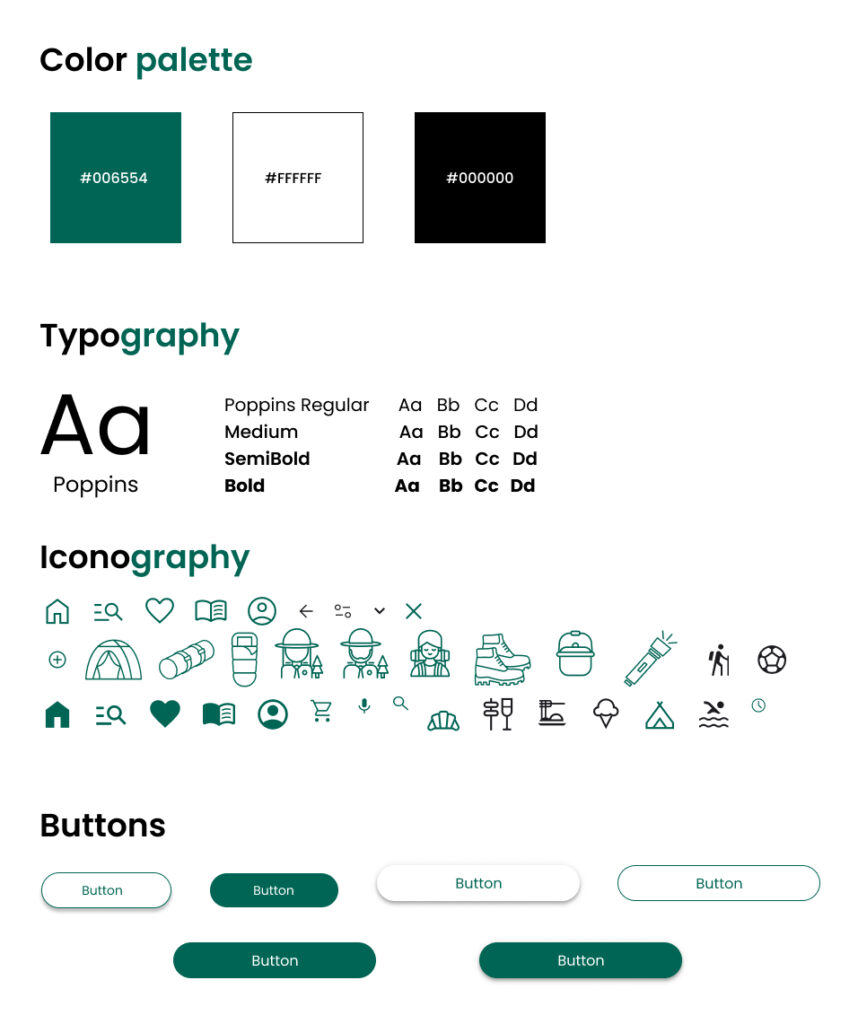
When choosing a color palette, I made sure my primary colors met WCAG AA Compliance before building out the UI for each screen.
I’m using only one typeface: Poppins. It’s sans serif font so it’s easy to read. Mixing too many different typefaces can make your app seem fragmented. It’s also makes it difficult for the user to know where to look.
I implemented a text hierarchy throughout the app. This help users to distinguish the different sections and information on screen.